
Attending trade shows and exhibitions are some of the best ways to drum up new interest in your business. You’ll have the opportunity to meet with decision-makers and get your brand in front of new people without having to meet with different partners individually.
Believe it or not, 51 percent of decision-making attendees at trade shows go on to request demonstrations and meetings at their home office. This means you could walk out with new leads or guaranteed partners after every show.
You just have to draw attention to your company from the very beginning. The best way to do this is to create an eye-catching banner. Here are a few simple tips to help you create the best roll up banner design for your upcoming show.
1. Make Your Logo a Priority
When you’re creating a vibrant and useful banner design, you need to make sure people recognize your brand immediately. The best way to do this is to incorporate your logo right on the banner itself.
Try to make the logo large enough that passersby can recognize it at a glance. It should be legible and to-scale with all of your regular logo uses.
If you change the logo’s color or proportions on the banner, even your most diehard supporters won’t recognize it as yours.
Most brands and companies see better success when they place their logo toward the top of the banner. People naturally read from the top of the banner down and placing your logo at the top makes it the first thing people notice.
If you can’t use it at the top of the banner or want to get a little more creative with your design, place the logo no lower than the middle of the banner. The lower it gets, the harder it is for people to notice it.
2. Pay Attention to Your Font Choices
The most successful banners are ones that are easy to read no matter where you’re viewing them from. People shouldn’t have to walk directly up to your booth to read what you’re advertising. They should be able to read it across the room or at least be able to mark your booth out amongst the others in the room without effort.
The best way to make sure your banner is easy to read is to select the right font.
Choose a font that’s bold and large enough to be legible from at least 15 feet away. The fonts you choose will largely depend on the ones that your designer can work with. They’ll be able to provide you with a list of suitable options as you finalize the design.
Most banners tend to use the same font throughout the design for consistency. This makes the banner look more polished.
If you decide to use different fonts for emphasis or as part of your design, make sure they work well together. The last thing you want is for people to miss part of your message because they couldn’t follow the flow of your banner or found one part difficult to read.
3. Use High-Contrast Colors in Your Roll Up Banner Design
Well-thought-out pop-up banner designs immediately draw the eye as soon as they’re deployed. The easiest way to immediately capture peoples’ attention is to choose high-contrast colors that make the banner’s message stand out.
If you design a banner with a light background, choose a dark color for the font and any text-based imagery you use. If your retractable banner design uses a dark background for blocks of text, choose lighter contrasting colors for the bulk of your text. This will make the message clear and noticeable from the beginning.
When selecting colors, make sure they don’t completely clash with the ones in your logo. Using your company’s primary colors is always a great way to establish consistency across your marketing materials.
4. Invest in High-Quality Images
No one wants to look at a blurry banner. Unfortunately, it’s a common occurrence for businesses looking to include images in their roll up banner design.
The images you choose for your banner should be high-quality, high-resolution images. This allows the printer to blow them up to fit your banner without blurring or distorting the images.
If you choose lower quality images, you risk having a blurry banner.
Not only is this an eyesore, but it can leave people feeling unsure about supporting your brand. If you don’t select great images, customers and clients might believe your services are low quality.
This can keep people from approaching you at trade shows and events.
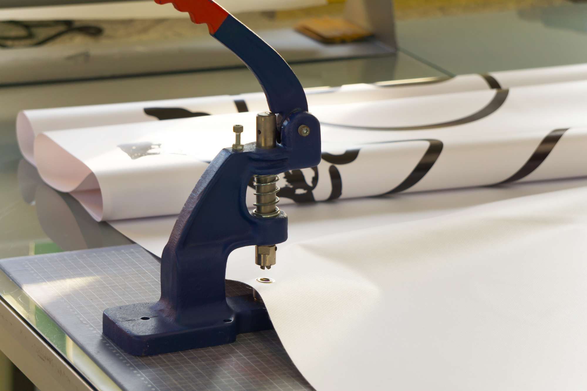
5. Think About Your Material Options
Believe it or not, you have more than one material to choose from when printing a banner. For most roll up banner designs, vinyl is the best choice.
It’s durable enough to stand up to outdoor events without fading or showing signs of wear and tear. The material is also ideal for printing and can showcase images without the ink running at all.
However, if you’re planning on using the banner exclusively indoors, a fabric or canvas banner may be a better choice. These banners are easy to roll up for storage and won’t get damaged when rolled properly for extended periods of time.
6. Figure Out a Way to Display the Banner
Once you have a general idea of your trade show banner design, you need to find a way to display it.
Tacking it to a table or hanging it from the wall behind your booth can work. However, you risk the banner getting blocked by bystanders or your own team members.
The best way to display your banner is with a retractable banner stand. These are incredibly lightweight and easy to set up for events on-the-go.
Look for a stand that’s made from durable materials and powder coated to protect against rust and damage to the metal itself.
The Right Banner Can Make a Huge Difference
Making your business stand out at trade shows is always a challenge. The right roll up banner design can give you an edge over the competition.
As long as the banner is eye-catching and conveys your message clearly to your prospective clients and partners, you’ll be in good shape.
Looking for more tips to help you stand out at your next trade show? Check out our most recent posts for more inspiration.